Monday, May 5, 2008

Audio Drawings

A few weeks back, we were asked to pick a non-lyrical song and to make illustrations out of the song. The drawing should have had nothing to do with the title of the song or anything like - but kind of how the song sounds and makes you feel.

It seemed as in class people drew how they felt when they listened to the song, its kind of what i did and I kind of tried to respond/show each instrument in my illustration. I used mostly black ink and charcoal. They had to be only black and white materials. 


Here is my final drawing. I did 4 small ones before I finally worked on this one and became happy with it. I think it really portrays the song well.... It starts at the top left and goes to the bottom - like we read here in the USofA.
 *btw, I did NOT intentionally make those shapes in the top half of the illustration look like music notes. I was going with the song with my ink and brush*

The song I used was "Cascade Locks" - By TalkDemonic
You can listen to the song HERE.

=] Enjoy! 

Memories

Around the same time as the eavesdropping/illustrations - we did this assignment as well. 
We had to create something about memory only using tape, pencil and paper and ink if we wanted but only 3 items. 

This did not come out to the high quality that I would have liked it to have been, I was kind of suck on this assignment and didn't really have a super solid idea for it. 
So what I did was I traced some old 4x5 negatives I have had and took a few years ago and then made it look like a photo album - relating sound, sight and what not to memory. 


 It isn't the best thing I've done but I did spend a decent amount of time tracing the negatives and cutting the tape as the photo borders. 

=]

Often Overlooked

Often Overlooked was our final project in Design 1. [art 140]

"Each Student will find ways to "drift" through the surrounding area of UNCG in search of aesthetic visual experiences often overlooked. To do this, students must take a closer look at the place we live and see things at a "micro-level"- highlighting the beautiful, corky and unique nuances of our city."

Originally all our photos were going to be made into one big book of the whole classes findings - but then our teacher decided to make us some how distribute our findings and make the work public - To let people know about what is often overlooked everyday.
The link above and here - www.oftenovergso.blogspot.com
is where I posted my 8 findings with photos and directions to them.
I made flyers for the blog and put them on Tate St and around the art building. I spent about 2 hours on making the poster itself... Its not as great as it could be but it is what it is and it grabs your attention.


I still have plenty and should distribute them further. I 'm going to try and keep up the often overlooked blog over the summer with similar items and things I might just find funny - If I get to photograph them - if not. I will try and write about them descriptively. I'm also doing an internship at Elsewhere Artist Collaborative this summer and its almost all about often overlooked items, So I might post photos and things I experience there at Elsewhere.

Our teacher also told us about this artist, Kate Pocrass, who he went to school with that he called the "queen of often overlooked". I got inspired by her journal of so called "mundane journeys" through her city, where she lives. I love the way she talks about things most people dont think about it and how poetic it is. You all should check her out at Mundanejourneys.com
I had a great semester in Design 1.
=]
I hope whom ever looked at this blog enjoyed it as well.

Sunday, May 4, 2008

Compositions

Early in March we had do this assignment during class in which we traced some business cards.. the outline, the shape of them - 4 to a page.

Then we went around the art building and drew interesting/simple compositions in the rectangles we had on the paper. We had to have about 2o rectangles. It was all about compositions and really nothing else.
Here are two of my sheets.


Enjoy!

Thursday, April 24, 2008

"stick" drawings

Back at the beginning of the semester, We had to draw these objects presented to us by our teacher - but we had to tape our pencils to a paint stirrer stick and draw the objects by holding the end of the paint stick while standing up.

Here is what I produced. 

They are by no means great drawings but they are pretty interesting considering how we had to draw them. 

=]

Tuesday, April 15, 2008

Craigslist assignment

In the end of January, We had an assignment to draw an object and post it on craigslist under the group of what the object was [ appliances, cameras, apperal, auto..etc] and not say anything about it being a drawing in the title but just listing it as the object that we drew. We had to list it around $10 and see if anyone would actually buy our drawings of this object.

I drew my medium format camera.

I got an email about wanting to by the camera and not the drawing - which the camera was and is not for sale. I emailed the guy back saying that it was just the drawing that was for sale and I think he or someone else reported it and took it down shortly after.

I dont think anyone in our class sold a drawing, but I think this was a really interesting assignment to see how people react to this kind of "trick".

Diebenkorn Charcoal Drawings

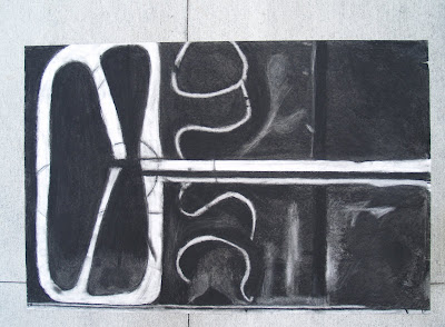
In class a month or so back, we had to recreate a Diebenkorn Charcoal drawing that our teacher gave us copies of in pairs. We had to recreate it to almost the exact original, with small details and everything.

Here is our recreation of the diebenkorn drawing our teacher gave us.


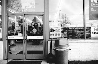
The following week, we had to search around greensboro- or where ever we live, around our small towns that we reside in or whatever... and photograph the side of building, the goal was to find a very flat surface. We had to try and find a side of a building that resembles the Diebenkorn drawing that we worked on in class.

I took this very literally, it didn't HAVE to look exactly like what we drew in class but the style of the simple lines and compositions that Diebenkorn creates in his drawings. But, I drove around in Kernersville and searched for a building that looks similar to the drawing above.

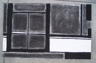
We then had to draw a Diebenkorn style charcoal drawing from the photograph we took of a flat building side.


Here is my drawing from the photograph I took to resemble the Diebenkorn drawing we did in Class.SO I took this photo and made it black and white and did the above drawing from it.

=]

Thursday, March 27, 2008

Line/Chance drawing

A few weeks after the semester started, we did these drawings in class where our teacher had a dice roller on the computer. It was some site on the internet, It was two dice. We made a list of 12 different kinds of lines we could draw. We drew a square anywhere on the page and came up with all different kinds of lines as a class. 
We each scrambled up all the different kinds of lines we listed different on our pages.
He rolled the dice and we had a mintue or 30 seconds to draw that kind of line, then he'd roll them again and we'd have the same time do a different kind of line. Whatever number the dice rolled on, was the kind of line we drew for what we listed. 


this is mine. It got pretty crazy after awhile, and it also kept rolling a lot of the same kinds of lines which got kind of annoying. haha. again, I've learned that assignments like this would be way cooler on larger paper but, I suppose that is what made this assignment a challenge was to try and fit it all in that box in a cool composition [ and not knowing what you were going to have to draw next.] 

=]

Wednesday, March 19, 2008

Helen O'Leary Visting Artist

We had to draw this artists exhibition in the Gatewood Gallery in the art building at school for design class.

We didn't have to make it pretty, just to show the work and the relationships between objects.

Mine aren't that great.
I started using measurement and realized it was going to take me 300 years to draw it if I did. Its lots of lines and over lapping things. anyhow... its semi-accurate.
So, don't judge from my drawings.
Go see the exhibition yourself. Its pretty neat... We had to hear the Artist talk today and it made the work a lot more interesting.

the drawing above was divided by a large white space between the beginning of the next drawing. her work was up on 3 different walls.


The two drawings below are of the same wall. it starts on the left and continues to the right as one piece til the "column' and that is another painting. I photoshopped the two images on the left together as one.. and there is some details missing between the two images for them to connect as one piece of work from the left to the right.

Monday, March 17, 2008

J Stencil value assignment

We had to do an assignment during class one day in which, we received stencils from all the letters of the alphabet. .I got J. We did this a month or so back. 
We had to make an interesting composition on paper with the stencils and use different values of graphite to fill in the stencils.

Here is mine. 
 It didn't fit all the way on the whole flatbed scanner but There isn't too much your missing from the edges really. 
I like how mine ended up kind of like a pattern or a design. 
almost.
I would have liked to see it on a larger scale. As much as big paper is annoying, I'm starting to realize that things are better on bigger paper. 

=]
[I started this post last week and just am now posting it on March 27th.]

Wednesday, February 27, 2008

Illustrations taken from over heard conversations

For my design class, we had to eavesdrop on strangers [ creepy, right? haha] and write down their conversations and draws some of the surroundings.
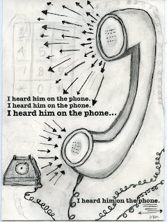
We took from those conversations snippets or whole parts of convos and had to illustrate them with text, value and shape. 3 of them. with ink,pencil and paper.

Here are my 3.


"I heard him on the phone."
"Do you have to draw a picture?"
"From now until then, that's how much time I have."
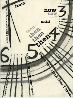
They are graphic and bold and I like them for the most part.
They could have been thought out a bit more, but I started with one item in the image and just started drawing and developing as I was going.

I like this assignment and it was our first big out of class assignment. 

More to come! Enjoy! 


Tuesday, February 12, 2008

Tracings


In the first week of my Design 1 class [Art 140]... We did tracings of any 5 images we liked that we found on google images. I chose an owl, a few black and white photographs and some modern/1970s designs. 

The first one is done with straight graphite pencil. We had to layer the images and put the center of all the images in the same place on the tracing paper.


The second one was the same concept but we could use color pencils as well and 5 different images if we so chose. Also, you could place the images how ever you liked on the paper.


This is a new blog for the Design 1 class. It will probably be updated more often than my brogan photo blog[b/c it is for a class], which is terribly unfortunately but when I blog I always end up typing too much and rambling. but who knows? 
so anyhow.
enjoy!